Components of The Primer
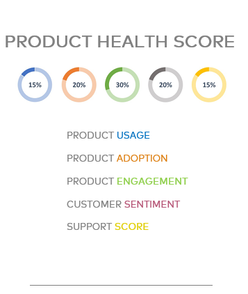
Setting goals and determining the appropriate weight percentage is critical when creating your Product Health Score and its components. If you discover that your user frequency percentage is 70%, how does that help in understanding the product health? Metrics can and should be viewed in a historical graph to observe user trends, but these metrics also need to be scored and evaluated. A historical graph of your Product Health Score is also useful and it helps us understand the product health in the aggregate. These trends in your Product Health Score or the components therein offer a lot of intrinsic user feedback.
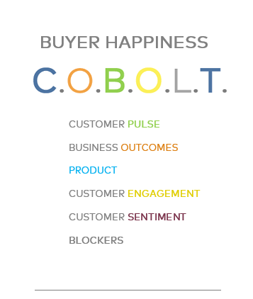
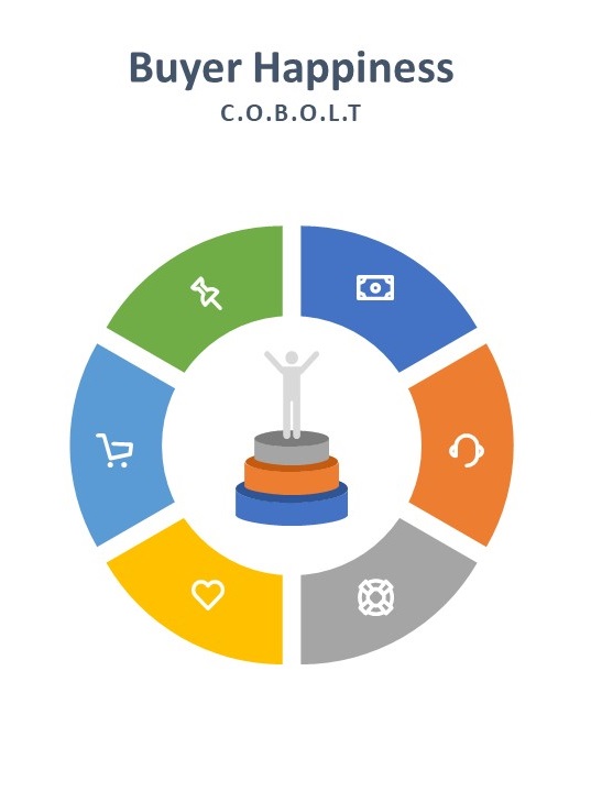
The C.O.B.O.L.T method is similar to methods that some large corporations have been using for quite some time. The acronym stands for C Suite, Owner, Buyer, Operation Level Touches. Operation referring to the levels of VP, Director, Manager, or any key decision maker. The Buyer Happiness component is important to understand and calculate independent of the Product Score and often overlooked. It doesn’t need to be explained that users in an organization are most likely mandated to use certain software or products, at times to their own chagrin. This fact emphasizes the importance of taking those decision makers feelings into account, especially when dealing with renewal.
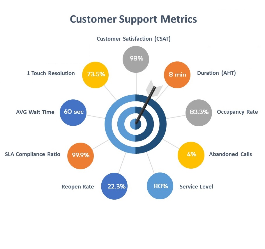
A good Service Level indicates proper resource allocation. It plainly displays if your customers are being connected to assistance in a timely manner. It is important to understand the various channels that customer will access for assistance.
80% of calls and chats answered within 20 seconds.
80% of emails responded to within 15 minutes.
80% of SMS messages responded to within 40 seconds.
Sign Up For More Great Info
© 2020 CX Primer, All Rights Reserved